")
CW-swiper manual
CW-swiper setup
Open Extensions->Modules from the Admin menu and add a new module of type "cw-swiper".
Administration
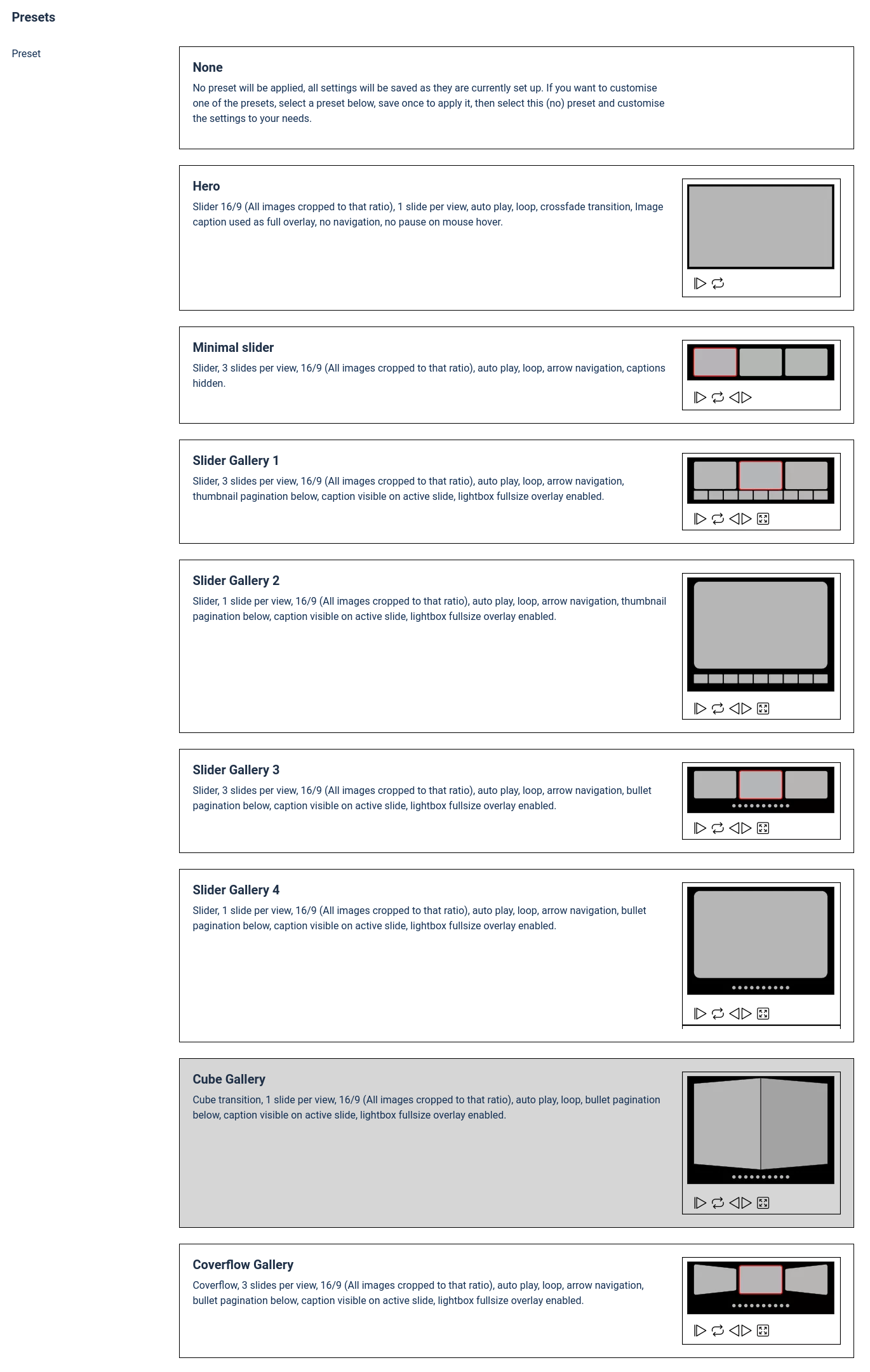
Presets (With CW-swiperXP plugin only)
The presets are an easy way to get things going with just a few clicks. Each preset sets up the module for a specific purpose. Please read the description of each preset for details.
You can also use the presets as a starting point and then customise the module as needed. This is done in a few easy steps:
- Select the preset that fits your needs the closest.
- Save the module once.
- De-select the preset (select "None")
- Customise the settings as needed.
- Save and publish.
Appearance
In this tab, you can set all the parameters to customize The look of CW-swiper.
Dimensions
Here you can set the sizes and ratio for the slides, and how they should be fitted into the stage of the slideshow. You cannot set the width and height of slides directly, they depend on the total space available for the module and the amount of slides shown at any time.
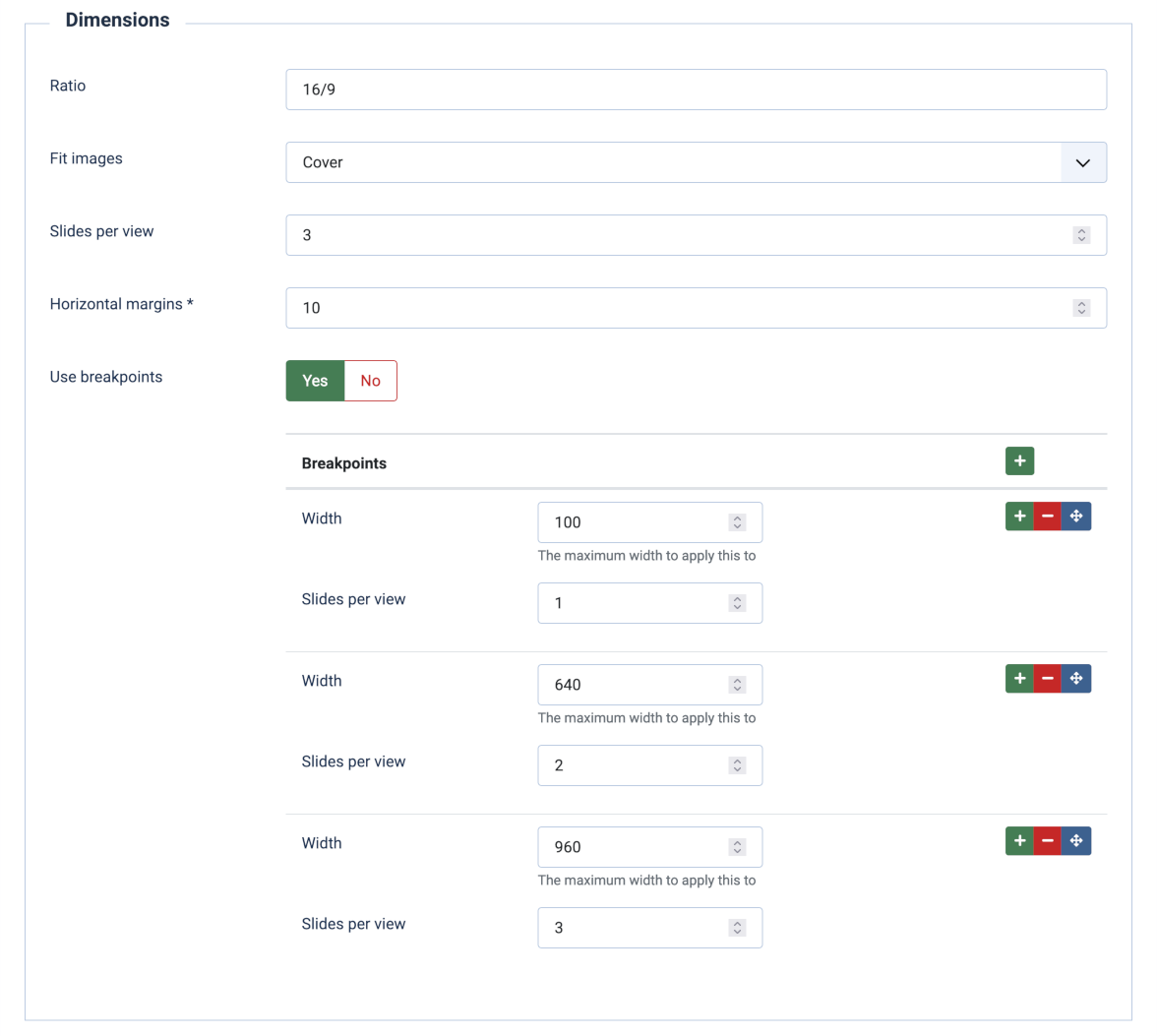
- Ratio
This sets the aspect ration of the slides. Width divided by height. Recommended if you’re using percentage width. Example: 4/3 or 1.3333333333. - Fit images
There are 5 ways to fit an image/thumbnail into a fotorama:
'Default' - Using the image’s own dimensions, no fitting.
'Contain' - The image will be scaled down to be fully displayed within the slide, keeping it's aspect ratio.
'Cover' The image will be scaled and if needed cropped to completely cover the slide.
'Fill' - The image will be stretched to fill the slide, regardless of aspect ratio.
'Scale down' - Shrinking the image if it is bigger than the slide. - Slides per view
How many slides should be visible at the same time. The slides will scale to fit. - Horizontal margins
Horizontal margins for frames in pixels. - Use breakpoints
With breakpoints you can decide, how many slides should be visible at the same time depending on the maximum width of the screen. If the width of the screen exceeds the given width, the next bigger breakpoint will be applied.
Design
Customize the look of the slider
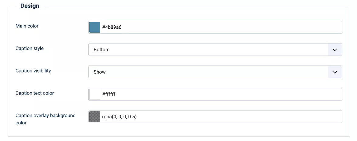
- Main color
This color that is used for some of the navigation lements, currently only for the numbered and filled bullet pagination. - Caption style (cw-swiperXP only)
The image captions set in the image manager (cw-swiperXP only) can be shown at the bottom or the top of the image or as a complete overlay that covers the entire image. - Caption visibility
When should the caption become visible? These are the options:Show = Always show on all slides
Hover = Only show on mouse over (Doesn't work on touch devices)
Active = Only show for the active slide - Caption text color
The color of the caption text - Caption overlay background color
The background color and transparence of the caption overlay.
Navigation
Choose the way, visitors can navigate through the slideshow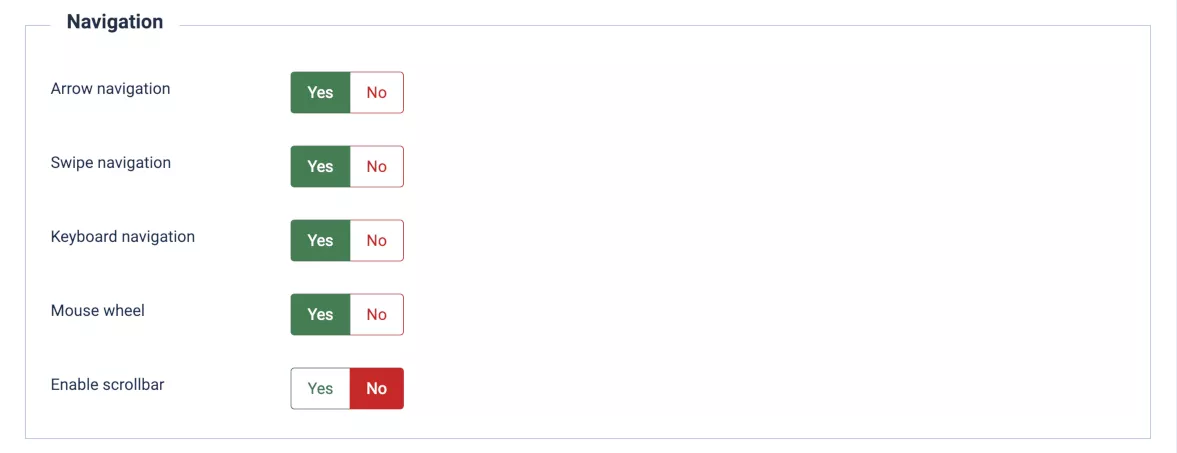
- Arrow navigation
Show arrow navigation buttons. - Swipe navigation
Enable navigation by swiping the image. - Keyboard navigation
Turn on keyboard navigation using the arrow keys Mouse wheel
Scoll through the slider by mouse wheelEnable scrollbar
Show a scollbar under the sliderScrollbar dragable
Make the scrollbar draggable
Pagination
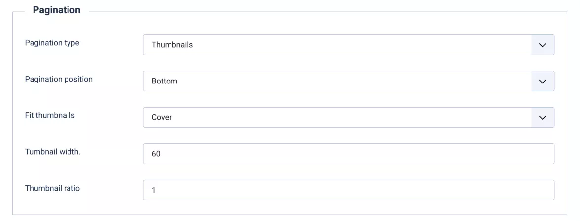
- Pagination type
Select the pagination type. Available options:
dots = simple filled dots
numbered dots = dots showing the slide number inside
thumbnails = small preview images
fraction = the total number and the current slide in the format: 2/10
none = no pagination - Pagination position
Place the pagination above or below the slider - Fit thumbnails (only visible if thumbnails pagination is enabled)
There are 5 ways to fit the images into the thumbnails:'Default' - Using the image’s own dimensions, no fitting.
'Contain' - The image will be scaled down to be fully displayed within the thumbnails, keeping it's aspect ratio.
'Cover' The images will be scaled and if needed cropped to completely cover the thumbnails.
'Fill' - The image will be stretched to fill the thumbnails, regardless of aspect ratio.
'Scale down' - Shrinking the image if it is bigger than the thumbnails. - Tumbnail width
Tumbnail width in pixels. Default: 60 - Tumbnail ratio
Size of the space between the thumbnails.
Behaviour
In this section you will find all parameters to set how fotorama should behave.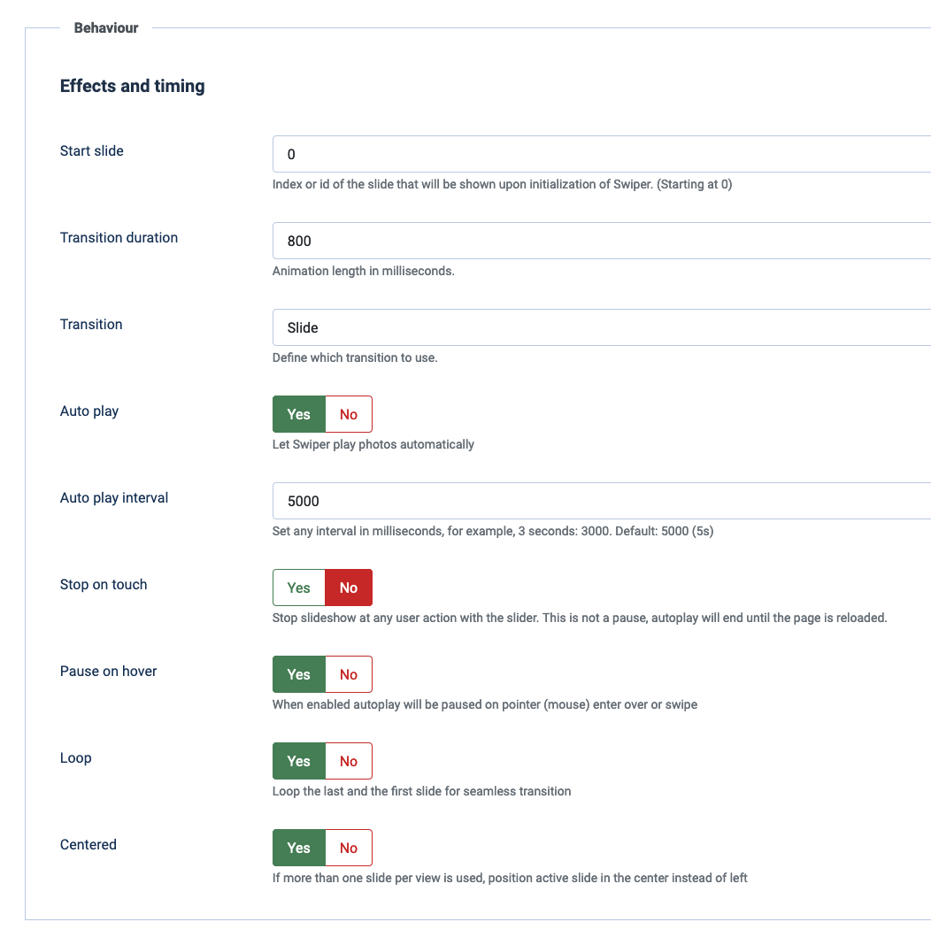
- Start slide
Index or id of the slide that will be shown upon initialization of the slider. (Starting at 0) - Transition duration
Animation length in milliseconds. - Transition
Select which transition to use. - Auto play
Let swiper play automatically - Auto play interval
Set any interval in milliseconds, for example, 3 seconds: 3000. Default: 5000 (5s) - Stop on touch
Stop slideshow at any user action with the fotorama. This is not a pause, autoplay will end until the page is reloaded. - Pause on hover
When enabled autoplay will be paused on pointer (mouse) enter over or swipe - Loop
Loop the last and the first frame for seamless transition. - Centered
If more than one slide per view is used, position active slide in the center instead of left
Enable the lightbox overlay popup to enlarge images.
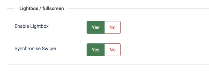
- Enable Lightbox
If enabled, a click on an image opens the original full size image in a full window overlay. - Synchonise swiper
If enabled, a click on one of the thumbnails in the lightbox will also move the slider to the same slide.
Images
Here you can select the image source and the image folder.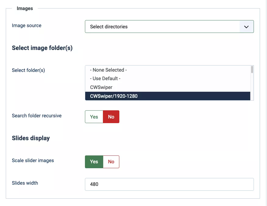
- Image source
Select the image source you want to use. Without the CW-fotorama XT plugin, only Select directories is available.- Select directories
Select one or more directories, within the "images" directory. All images in these directories will be shown in alphabetical order. - Image manager (only available with the CW-swiperXP plugin)
The image manager enables you to select, upload and organize individual images and add captions. It is described in the next tab "Image manager".
- Select directories
- Search folder recursive (Only visible when Select directories is active)
Grab images from the selected folder(s) and all sub-folders - Scale slider images
Scale image files for slides to save memory and loading time - Slides width
Width of the rendered slide preview images, aspect ratio will be preserved. This is the size of the generated image files, not the displayed size of each slide, which is determined by the avilable space for the entire slider and the amount of images shown at once.
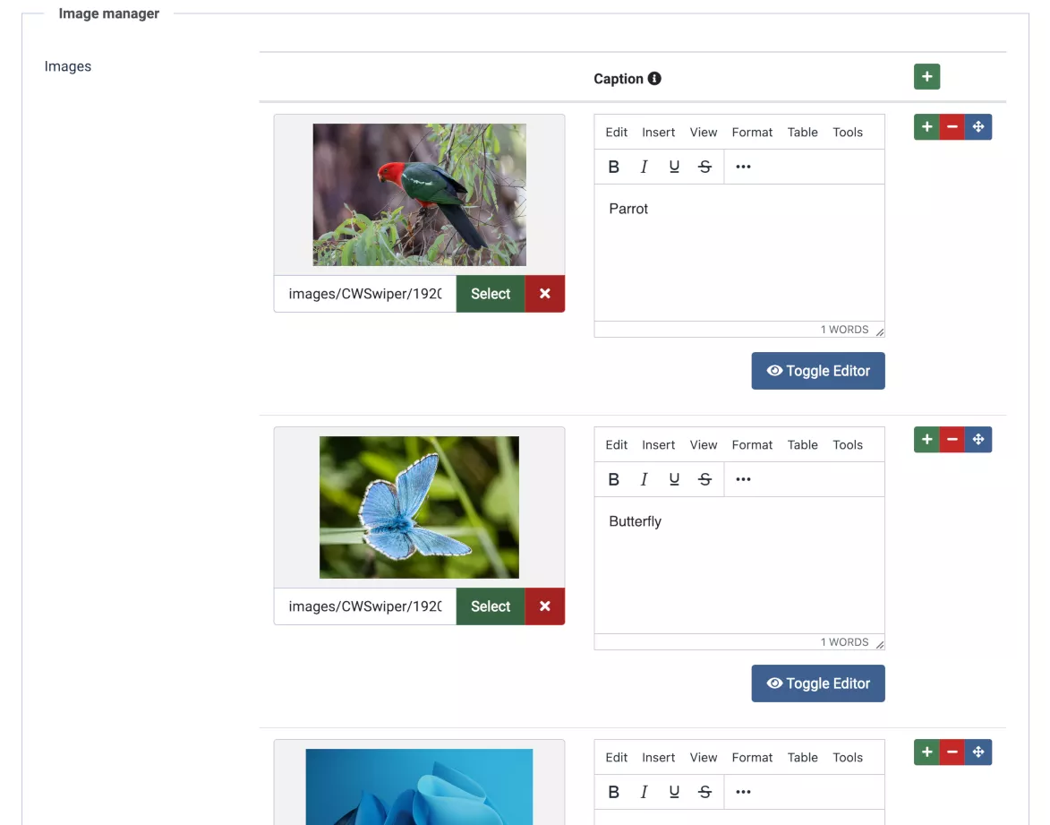
Image manager
The image manager enables you to upload and use images from the joomla media center. You can sort the images by dragging them around, and you can add captions to individual images. The captions can contain html and it is rather easy to style them via css within your template.