")
CW-timeline Anleitung
Open Extensions->Modules from the Admin menu and add a new module of type "cw-timeline". The setup of the module happens in the tabs "Module", "Styles" and "Entries". The other tabs contain the general settings that you find in all Joomla-modules.
Click through the tabs below to read the instructions for the respective tab in the cw-timeline module:
Administration
In the module tab the basic settings for the timeline are configured. Here you set the behaviour and some basic layout parameters. The settings are described in detail below.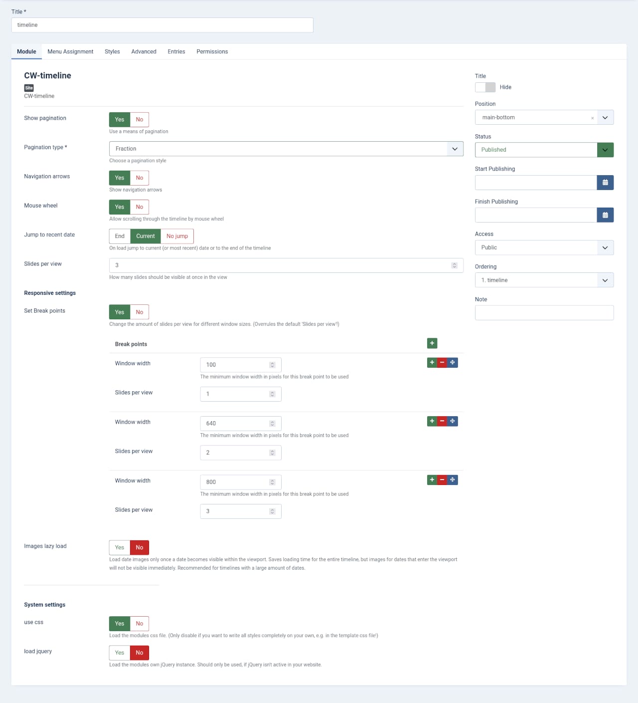
- Show pagination
If enabled, a pagination will be displayed above or below the timeline. If it shows above or below, depends on the kind of pagination. - Pagination type
Here you can set the type of pagination. The available types are:- Bullets: A set of clickable bullets is shown below the timeline.
- Fraction: The current page and the number of total pages will be shown below the timeline.
- Progress bar: A growing progress bar will be shown above the timeline.
- Navigation arrows
Enable back/forwards arrows on the sides of the timeline. - Mouse wheel
Allow scrolling through the timeline by mouse wheel. - Jump to recent date
On load, the timeline starts at current or latest date:- End: Start at the most recent date
- Current: start at the date that is nearest to the current day
- No jump: start at the beginning of the timeline (oldest date)
- Slides per view
How many date-slides should be shown per page. This can be specified for different window sizes with the next setting "Set Break points". - Set Break points
Here you can enable and specify how many Slides per view should be shown depending on a given minimum window size. You should set these up beginning from the smallest to the largest setting to avoid errors. These settings will override the "Slides per view setting!" - Images lazy load
Images will only be loaded once they become visible. This increases the initial loading time of the timeline, but it may take a few seconds until images become visible after the slide enters the viewport.
System Settings
In most cases you don't need to change anything here.
- use css
Use the css styles that come with the module. If you want to create the complete styling of the timeline from scratch, you can disable the default styles here. Only recommended for advanced users. - load jquery
The module needs jQuery to work. If your joomla template doesn't use jQuery and you don't load jQuery in any way, you must enable this for cw-teimline to work at all.
This is where you set and customise the look and feel of the timeline. The options are explained in detail below.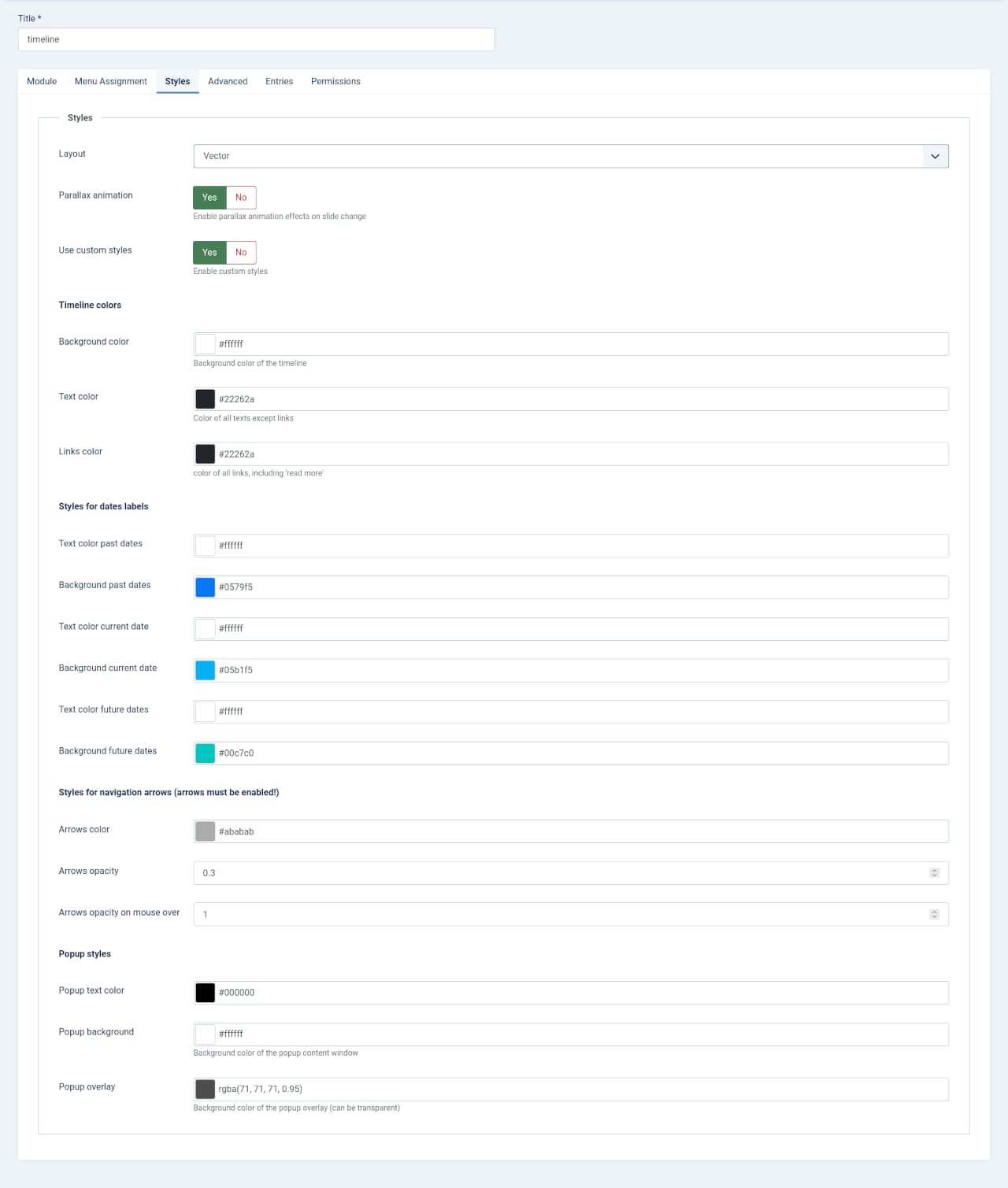
- Layout
Here you can choose between 4 different layouts. Each layout can then be customised with the options below. More layouts will be published and become available in future updates. It wouldn't make sense to describe the layouts here in detail, just switch through them and see how they look. If you haven't bought cw-timeline yet, you can check them out in the demo. - Parallax animation
Only available in some of the layouts, at the time of wirting this, these are "Vector" and "Slim". Enable some fancy parallax effects for these layouts. Again, just enebale and try them out. - Use custom styles
If enabled, you get a load of options to customise the colors of the timeline. Some of these options are specific to certain layouts and will only available, if the respective layout is enabled. The options are pretty self-explanatory.
In this tab you finally add your date entries. Add a new entry by clicking the green plus button on the top right of the page or to the right of each existing entry. The options are explained in detail below.
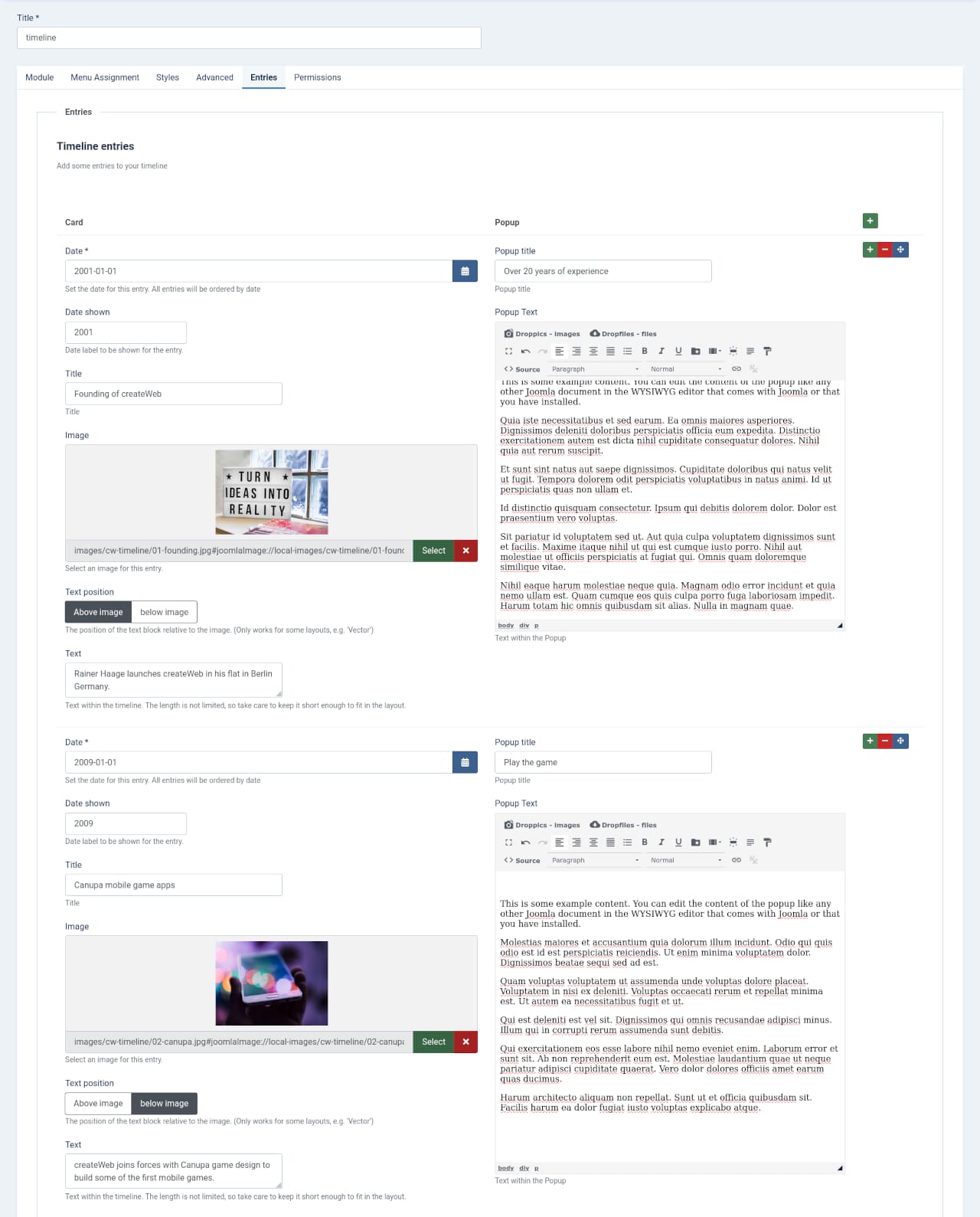
Each entry is split in two sections: Card and Popup. The "Card" section is the content of each date-card in the timeline. The "Popup" section is for the content of the popup with more details for each entry. If you leave the fields in the Popup section blank, no "read more" link will be shown for that entry. You can add new dates by clicking the green "+" button on the top right of the page or in each entry. Press the red "-" button to delete the card. Grab the blue arrows-button to drag cards up and down to change the order. Don't forget to press "Save" on the top of the page once you are done.
The Card section:
- Date
the actual date for the card. This will not be shown anywhere on the timeline, it just determines the ordering of the timeline and the "Jump to recent date" option set in the "Module" tab. - Date shown
This is the date information that will be visible on the timeline. It is separate from the actual date set above so you can write here whatever you want, without compromising the order of the timeline. - Title
The title of the card. - Image
The image of the card. Each image should have exactly the same size, otherwise the layout will be compromised. - Text position
The position of the text block relative to the image. (Only works for some layouts, e.g. 'Vector'). You can utilise this e.g. to alternate the positions so that all even entries have the image on top and all odd entries below the text. - Text
The text for the date-card. Take care to keep the texts short enough so they don't grow out of the cards.
The Popup section:
- Popup title
The headline of the popup that shows when you click "read more" on the card. - Popup Text
The extended content of the date. You are not limited to text here, it is also possible to use images here.